
By Rosemary Pearson August 25, 2025
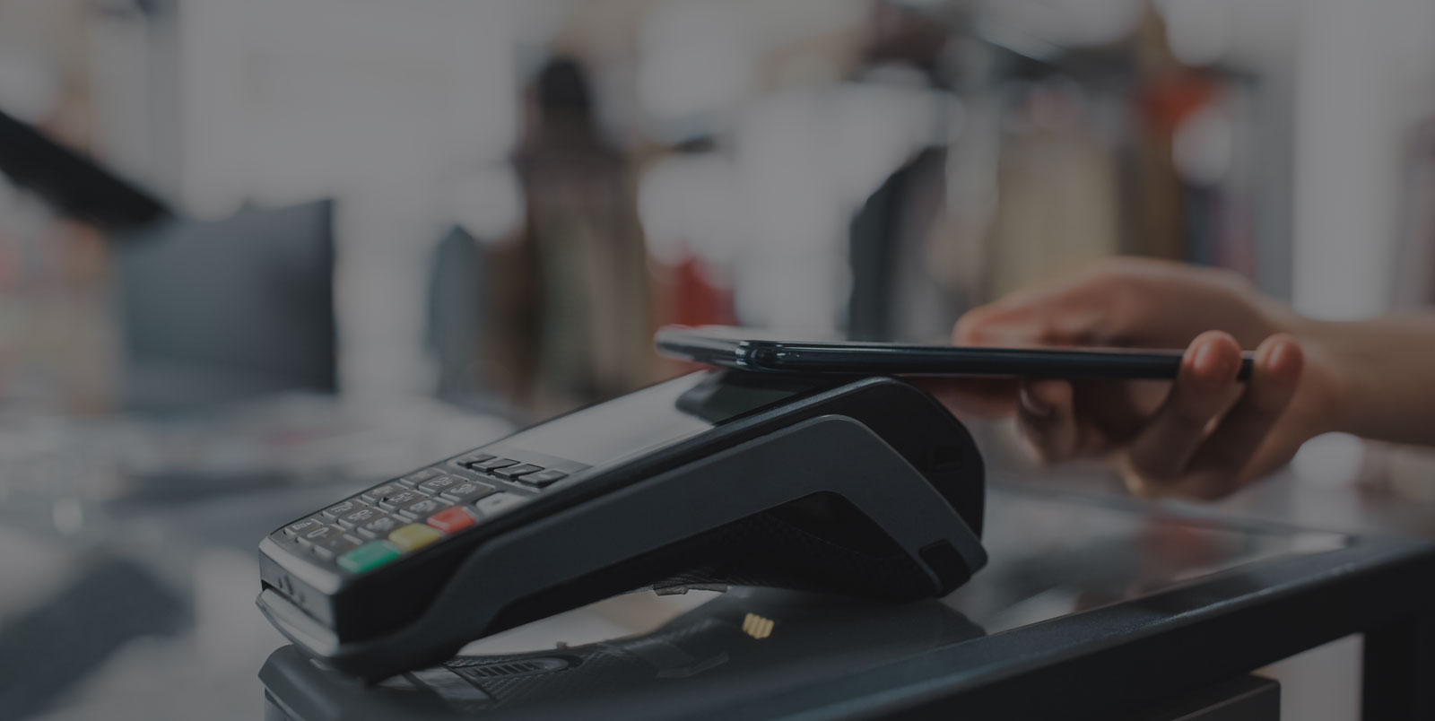
Checkout Psychology: The online checkout process is the moment of truth for e-commerce businesses. Shoppers may browse for hours, add items to their carts, and compare prices, but if they abandon the checkout process, all the effort invested in acquiring them goes to waste. This is where checkout psychology becomes critical.
It focuses on the small design elements, behavioral cues, and user experience decisions that determine whether a customer completes a purchase. These micro-UX changes may appear subtle, such as button placement, progress indicators, or the wording of error messages, but they significantly influence buyer confidence and satisfaction. For businesses aiming to improve profitability, refining the checkout journey is just as important as attracting traffic or offering competitive products. The right balance of simplicity, trust, and persuasion can transform hesitant browsers into loyal customers.
Understanding Checkout Psychology
At its core, checkout psychology is about reducing friction and building trust during the final steps of an online purchase. Human decision-making is shaped by emotion as much as logic, and checkout design needs to account for both. A complicated form, hidden fees, or unclear shipping details can trigger doubt, leading customers to abandon their carts.
On the other hand, clear progress indicators, reassurance about payment security, and simple instructions create confidence. This psychology explains why businesses invest heavily in e-commerce conversion design. Even small changes in layout or messaging can create an immediate improvement in conversions. When the checkout process aligns with user expectations and reduces mental effort, customers are more likely to follow through with their purchases.
The High Cost of Cart Abandonment
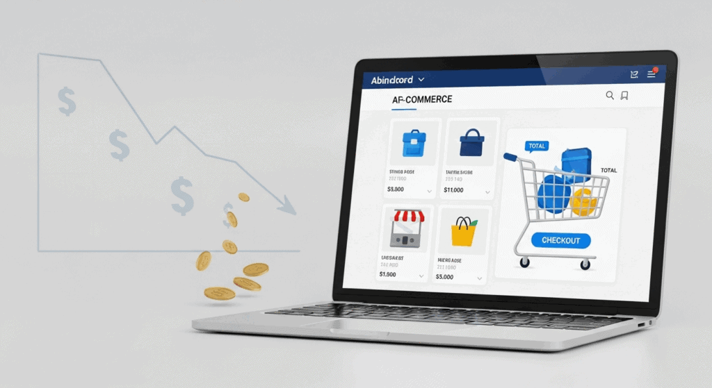
For many online retailers, one of the biggest challenges is cart abandonment. Industry studies consistently show that a majority of online shopping carts are never completed. While some customers are simply browsing, many leave because the checkout feels frustrating or untrustworthy. Hidden shipping costs, lengthy forms, or confusing payment options all contribute to drop-offs. Businesses that want to reduce cart abandonment e-commerce need to understand the psychological triggers behind these decisions.
Offering transparent pricing, clear return policies, and simplified processes reduces uncertainty. Customers often compare the effort required with the reward of completing the purchase. If checkout feels like a chore, they may leave, even if they want the product. By optimizing micro-UX elements, businesses can recapture lost opportunities and turn abandoned carts into completed transactions.
Micro-UX and the Power of Small Changes
Micro-UX refers to the subtle design features that guide users through digital interactions. These small details may seem insignificant, but they add up to create an overall sense of ease and trust. In the context of checkout, micro-UX elements include autofill functions and Checkout Psychology, error validation messages, and confirmation cues. For example, a green checkmark appearing after an email address is validated reassures the customer instantly.
Similarly, progress bars showing how many steps remain help users feel that completion is near. These details demonstrate how checkout UX tips can significantly impact conversions. Businesses that pay attention to these nuances often find that minor design tweaks produce measurable improvements. By focusing on micro-UX, companies move beyond aesthetics and address the deeper psychological needs of clarity, reassurance, and efficiency.
Simplifying Forms for Better Conversions
One of the biggest friction points in checkout is lengthy or complicated forms. Every extra field increases the chances that customers will abandon their purchase. Successful e-commerce conversion design emphasizes simplicity. Businesses can streamline forms by only requesting essential information and using smart defaults or autofill to speed up completion.
For instance, automatically detecting a customer’s city and state once the ZIP code is entered saves time and reduces frustration. Providing real-time feedback, such as highlighting incomplete fields, also prevents errors from piling up. These optimizations may seem like minor details, but in reality, they tap directly into checkout psychology. When users feel that checkout is quick, intuitive, and respectful of their time, they are far more likely to complete transactions.
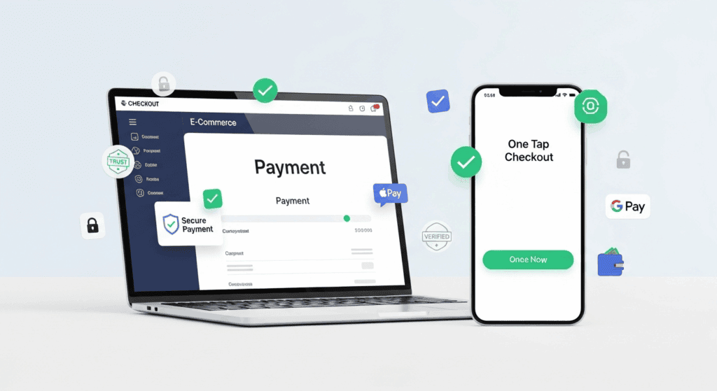
Trust and Security as Psychological Anchors
Trust is one of the most powerful factors in online purchasing decisions. Customers need assurance that their payment details and personal information are safe. Adding visible trust signals, such as SSL certificates, payment partner logos, or security badges, reassures customers during checkout. Clear policies on returns, refunds, and customer support also build confidence.
Businesses that want to reduce cart abandonment e-commerce must understand that trust is not optional—it is essential. Even a small doubt about security can derail a transaction. Micro-UX features, such as showing secure icons next to payment fields or reassuring text near the purchase button, anchor customer confidence. The combination of technical safeguards and psychological reassurance ensures that customers feel protected, making them more willing to finalize their purchases.
| Checkout Factor | What It Means | Psychological Impact | Result on Conversions |
|---|---|---|---|
| Micro-UX Changes | Small design tweaks like button placement, error messages, or progress bars | Builds clarity, reduces stress | Higher completion rates |
| Simplified Forms | Short, autofill-enabled forms with only essential fields | Reduces friction and mental effort | More users complete purchases |
| Trust & Security | SSL badges, secure payment logos, clear return/refund policies | Creates confidence and reduces anxiety | Customers feel safe to finalize payment |
| Payment Flexibility | Multiple options: credit cards, wallets, BNPL, regional payments | Gives users control and convenience | Fewer cart abandonments |
| Mobile Optimization | Fast loading, thumb-friendly buttons, one-click checkout | Removes frustration and distraction on mobile | Smoother mobile conversions |
| Social Proof | Reviews, ratings, “most popular” badges | Reinforces trust through community validation | Increased buyer confidence |
| Personalization | Remembering user info, tailored delivery/payment options | Makes customers feel valued and recognized | Stronger loyalty and repeat purchases |
| Transparency | Clear pricing, shipping details, and no hidden fees | Builds honesty and prevents last-minute surprises | Lower abandonment rates |
The Role of Payment Flexibility
Another major factor in checkout psychology is payment flexibility. Customers today expect more than just credit card options. Digital wallets, buy now pay later services, and regional payment methods often influence whether a purchase is completed. A shopper may abandon a cart simply because their preferred payment option is unavailable.
By integrating multiple choices into e-commerce conversion design, businesses demonstrate inclusivity and convenience. The placement of these options also matters; presenting them clearly at the right moment reduces hesitation. Even the wording of the final call-to-action button can influence outcomes. Labels like “Complete Secure Purchase” are more reassuring than simple “Buy Now” buttons. Offering flexibility shows respect for customer preferences while tapping into the psychology of reassurance and control.
Speed and Mobile Optimization
Modern shoppers expect speed. A checkout process that lags, loads slowly, or is difficult to navigate on mobile devices quickly drives users away. Given the rise of mobile commerce, optimizing checkout for smartphones is essential. Elements like thumb-friendly buttons, one-click payments, and responsive layouts all play into checkout UX tips that enhance performance.
Fast loading pages reduce frustration and create a smoother experience. In mobile contexts especially, distractions are common, and a long or clumsy checkout process increases abandonment risks. Speed does not just mean technical performance; it also means reducing the number of steps required. A streamlined mobile-optimized flow demonstrates how businesses can reduce cart abandonment e-commerce simply by respecting the time and habits of customers who increasingly shop on smaller screens.
Social Proof and Reassurance in Checkout
Customers often seek reassurance that others have made similar purchases without regret. This is where social proof becomes a powerful psychological tool. Displaying customer reviews, ratings, or testimonials near the checkout reinforces trust. Badges like “Most Popular Choice” or “Recommended by 10,000 Customers” influence behavior by signaling that a purchase is safe and validated. Integrating social proof into e-commerce conversion design reduces uncertainty.
Customers feel less alone in their decisions when they know others have already had positive experiences. Even subtle cues, such as showing recent purchase notifications, can trigger urgency and confidence. These micro-UX touches align with checkout psychology, as people are more comfortable completing purchases when they feel part of a community making similar choices.
Personalization and Psychological Comfort
Shoppers appreciate when the checkout experience feels tailored to them. Personalization can range from remembering past orders to offering relevant shipping options. By integrating data into the process, businesses create a sense of recognition and convenience. Personalized checkout UX tips include greeting customers by name, pre-filling saved details, or suggesting delivery preferences based on previous behavior.
These small touches enhance psychological comfort, making customers feel valued. At the same time, personalization reduces decision fatigue by simplifying choices. For instance, showing preferred payment methods first streamlines the process. In checkout psychology, these moments of personalization matter because they create a sense of familiarity and trust, turning a potentially stressful task into a smooth, reassuring experience that encourages completion.
Measuring the Impact of Micro-UX Changes
To truly benefit from checkout optimization, businesses must measure the outcomes of their efforts. A/B testing allows companies to compare different versions of checkout flows, identifying which micro-UX changes lead to higher conversions. Tracking metrics like completion rates, bounce rates, and time spent on checkout pages reveals patterns that guide improvements.
By applying businesses’ e-commerce conversion design strategies systematically, companies learn Checkout Psychology what resonates with their audience. Measurement also prevents over-designing or making changes that confuse rather than help. For example, testing button colors, wording, or form layouts provides concrete data on how psychology translates into action. Without measurement, optimization is guesswork. With data-driven refinement, businesses continually evolve their checkout process, ensuring they consistently reduce cart abandonment e-commerce and maximize conversions.
The Emotional Impact of Checkout Design
Emotions play a bigger role in purchasing decisions than many businesses realize. While logic drives product comparisons, the final step of completing a purchase is often swayed by how customers feel during checkout. Anxiety, doubt, or irritation caused by confusing layouts can derail a sale. On the other hand, calm and confidence created by smooth checkout psychology encourage follow-through. Colors, wording, and even the pace of the process affect emotions.
Warm tones and reassuring language help Checkout Psychology customers feel safe, while aggressive upsells or cluttered screens increase pressure. Incorporating subtle checkout UX tips, like gentle progress indicators and friendly microcopy, reduces negative emotions. Businesses that prioritize emotional comfort in e-commerce conversion design ultimately create an atmosphere of trust and ease, making customers more likely to finish their purchase and return for future transactions.
The Role of Transparency in Reducing Abandonment For Checkout Psychology
Transparency is one of the most powerful tools to reduce cart abandonment e-commerce. Unexpected fees, unclear shipping timelines, or hidden conditions frustrate customers and lead them to leave their carts behind. Modern consumers value honesty, and checkout experiences that are upfront about costs and policies outperform those that surprise shoppers at the last step. Micro-UX changes such as displaying total prices early, offering delivery estimates before the payment page, and highlighting return policies clearly all contribute to trust.
This aligns with core principles of checkout psychology, where transparency reassures users they are making an informed decision. Businesses that integrate clear disclosures into e-commerce conversion design find that customers are more willing to commit, as the process feels honest and predictable rather than manipulative or uncertain.
Checkout Psychology and Mobile-First Experiences
With mobile commerce steadily increasing, optimizing checkout flows for smaller screens has become non-negotiable. Poor mobile design is a leading cause of cart abandonment, as users faced with tiny fields or hard-to-tap buttons often give up. Applying checkout UX tips to mobile means designing forms that fit neatly on screens, using large, thumb-friendly buttons, and enabling digital wallets for one-tap payments. Mobile optimization also aligns with checkout psychology, as shoppers expect convenience and speed when purchasing on the go.
Clear navigation and Checkout Psychology, reduced steps, and auto-saving progress are critical in this context. For businesses, embedding mobile-first thinking into e-commerce conversion design ensures they do not lose sales simply because checkout feels cumbersome. A seamless mobile flow is not just a convenience—it is essential for maintaining competitiveness and reducing abandonment rates across all devices.
Future Trends in Checkout Experience
The future of checkout will likely involve even more personalization and automation. Emerging technologies such as AI-driven recommendations, biometric payments, and one-click authentication are already reshaping expectations. These innovations are closely tied to checkout psychology, as they reduce cognitive load and make purchasing feel effortless. Example For Checkout Psychology, predictive algorithms may suggest the preferred shipping method before customers even choose, or voice-assisted checkouts may streamline mobile experiences further.
Businesses will need to stay ahead by integrating these trends into e-commerce conversion design, ensuring they remain relevant as customer expectations evolve. At the same time, focusing on Checkout Psychology core principles like trust, simplicity, and transparency will remain timeless strategies to reduce cart abandonment e-commerce. The future will combine cutting-edge technology with the fundamentals of human-centered design, creating checkout experiences that are intuitive, fast, and emotionally reassuring for every shopper.
Also Read: How to Handle a Credit Card Processing Outage: A Step-by-Step Plan
Conclusion For Checkout Psychology
The psychology of checkout is a delicate balance of trust, simplicity, and persuasion. By focusing on micro-UX changes, businesses can dramatically improve their conversion rates without overhauling their entire platform. Every element—from form fields and payment options to trust signals and personalization—affects whether a customer completes a purchase.
Using strategies rooted in checkout psychology, companies can identify friction points and replace them with clear, reassuring experiences. The cumulative effect Checkout Psychology of small details creates a seamless journey that feels safe, efficient, and customer-friendly. For businesses aiming to thrive in the digital marketplace, adopting checkout UX tips and applying effective e-commerce conversion design is essential. The checkout page is not just a technical step—it is the final chapter of the customer journey, and with careful attention, it can transform hesitation into loyalty and browsing into lasting sales.